Scientists use graphical and statistical methods to analyse patterns of data related to disease.
Drawing bar charts
Data are often displayed in a graph or chart. These might display trends that are not as clear when just looking at data in a table.
Bar charts show data collected for separate groups. The height of the bar is proportional to the measured number or frequency.Note that the bars in a bar chart are all the same width. They do not touch each other as they show distinct categories.
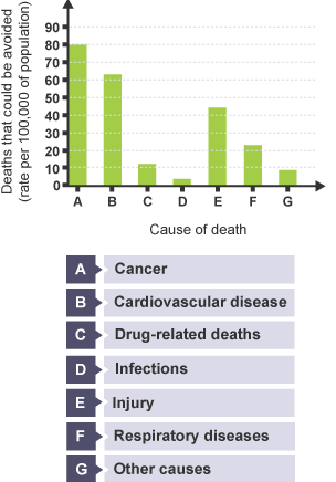
This table of data and bar chart show the number of deaths that could be avoided in England and Wales in 2013 from different causes.
| Cause of death | Number of deaths that could be avoided, rate per 100,000 of population |
|---|---|
| Cancer | 80 |
| Cardiovascular disease | 62 |
| Drug-related deaths | 11 |
| Infections | 3 |
| Injury | 35 |
| Respiratory diseases | 23 |
Source: Office of National StatisticsQuestion
Use the information in the bar chart to find out the number of deaths that could be avoided resulting from causes other than those in the table.Hide answer
Nine per 100 000 of population.
Note that bar charts are sometimes displayed horizontally.
Histograms
Histograms look similar to bar charts, but show how the frequently data occur within certain ranges.
The independent variable is therefore continuous and is divided into sub-sections or classes.The bars of a histogram are next to each other. The area of each bar is proportional to the frequency of each class interval. The bars of a histogram may not be the same width – it depends on the range they cover.
This histogram shows data from a Scottish study of the proportion of people of different ages with depression who consult their doctor. The independent variable here is age, but the histogram shows different groups within the variable of range allowing the data to be visually comparable.Source: The Information Services Division Scotland (NHS Scotland)
